Kakano Whakairoiro
Graphic texture
Our display typeface can be used in a range of expressive ways to add texture and visual interest to our layouts.
Please work with the Wellington City Council Creative and Brand team.
Core display typeface as texture
Having a distinctive display typeface means we can celebrate words and use them to add texture and visual interest to layouts. When using our typeface in this way, readability is less critical as Die Grotesk is used alongside it for informative copy.
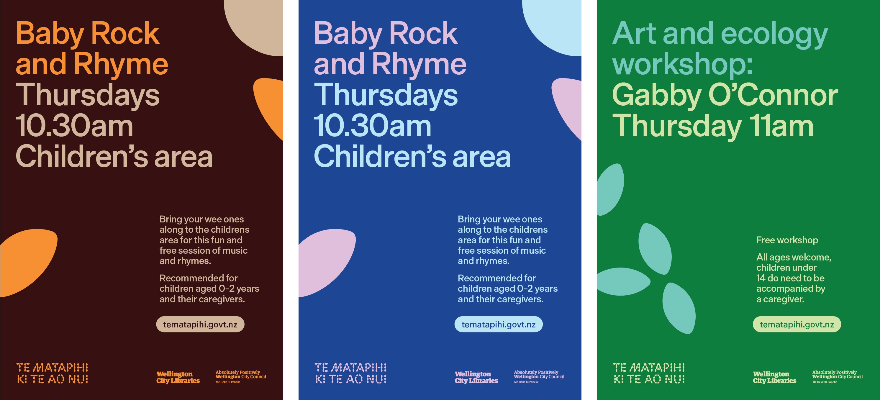
How to create single layer crops


Choose words or letters from one of our display typefaces
Find an interesting crop
Choose colours from our palettes.


Extended growing display
type family
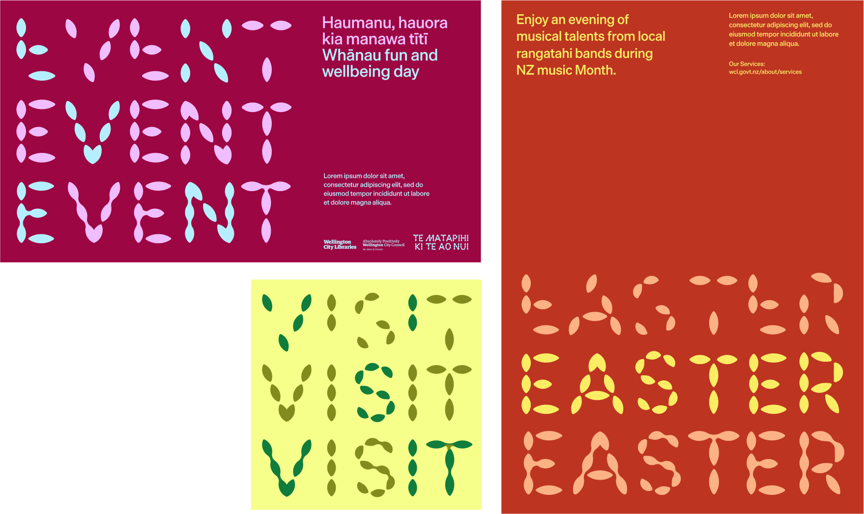
Alongside our core display typeface, we have an extended type family in various stages of growth. This extended family is for textural graphic use only and is not to be used in headings or any other informative copy.
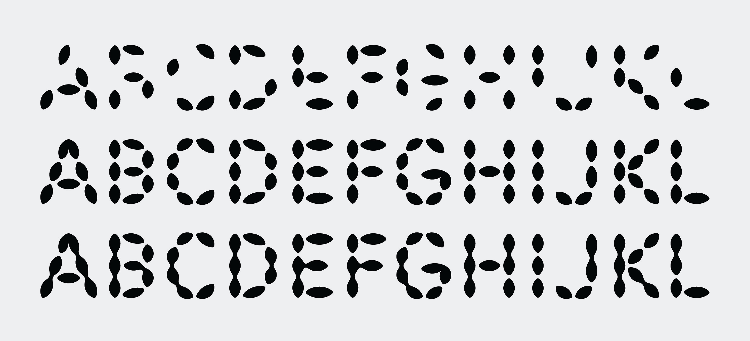
How to create two layer crops


Choose words or letters from one of our core typeface
Find an interesting crop
Chose a second letter or word from our growth typefaces
Choose colours


Low contrast crops
There are times where our colour palettes will have too much contrast for a background texture. In these cases, it is possible to use tones of the background colours instead.
How to make low contrast textural crops
Select one of our palettes
Find one or two low contrast tones of the background colour
Apply to your crop


Low contrast textural crop in use

Example layouts
There are a range of ways our extended display type family can be used to add visual interest and texture to layouts, the below examples are grouped into key uses.
Type + textural crops
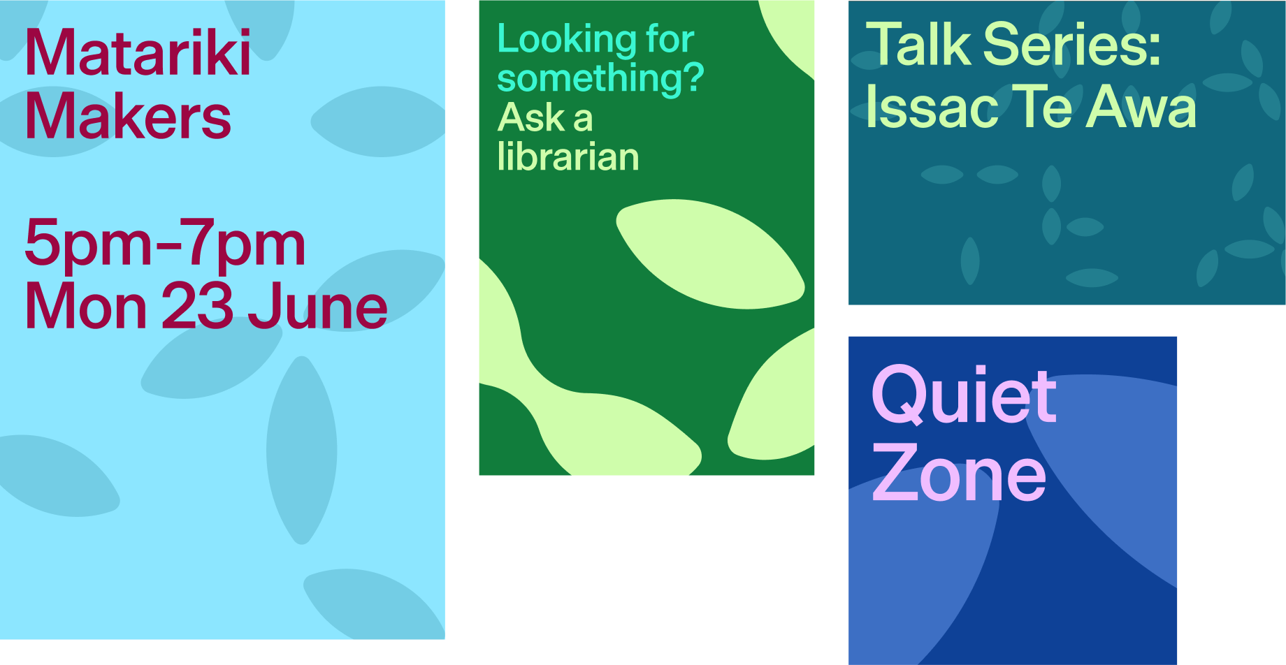
Large typeform crops as windows
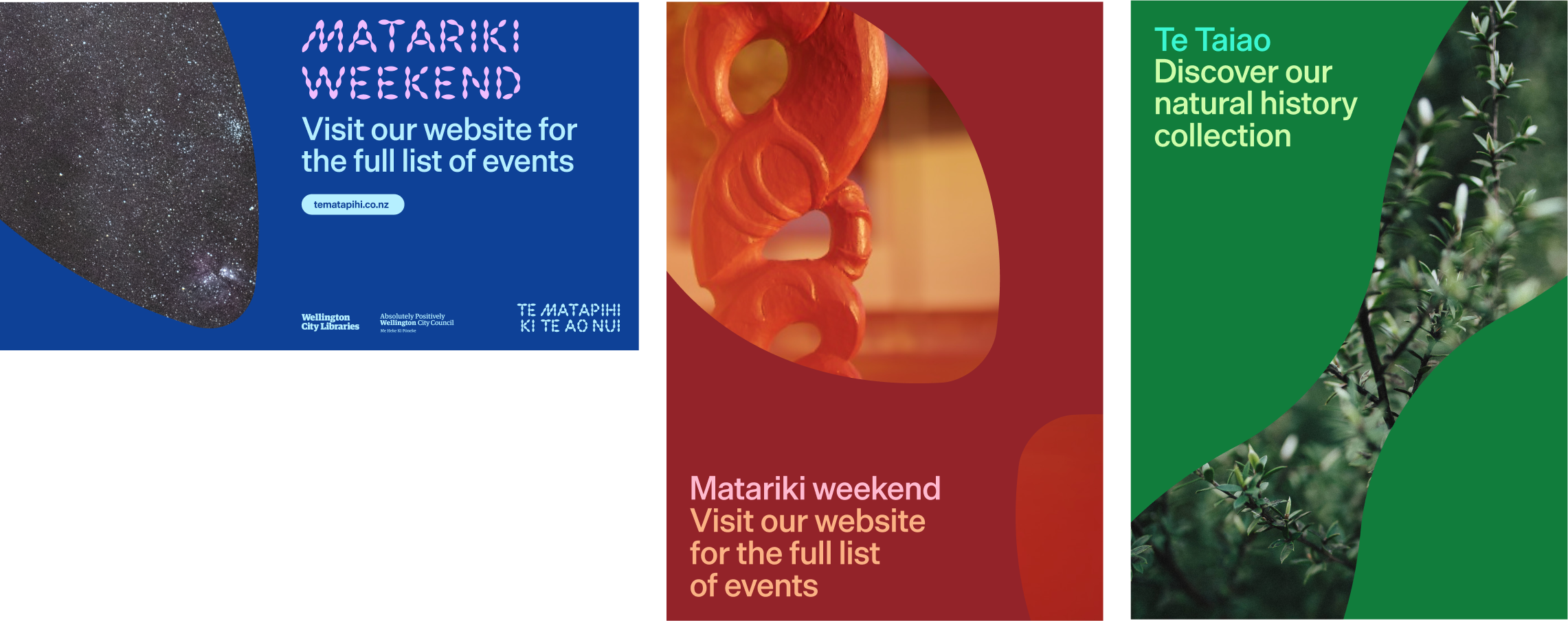
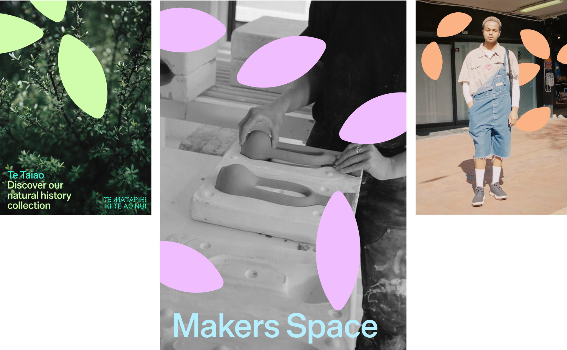
Crops layered with photos
Typeface growth as graphic words
Incorrect Usage


Do not make new patterns with our motif


Do not make pictures with our motif


Do not use more than three colours or tones for a crop


Looking for something?
Ask a librarian
Do not overlap text with low contrast
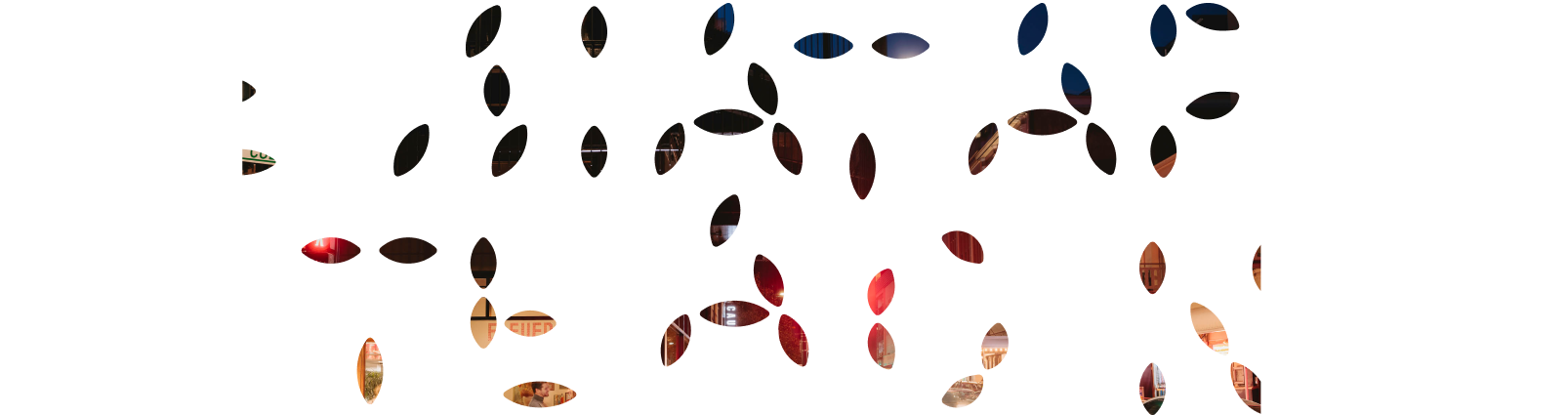
Do not put image inside complex crop
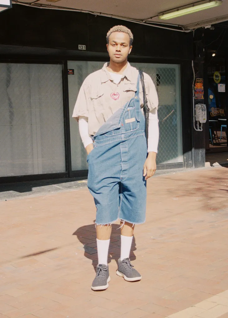


Do not place graphic over people’s faces