Ngā tohu
Wordmark
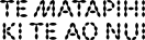
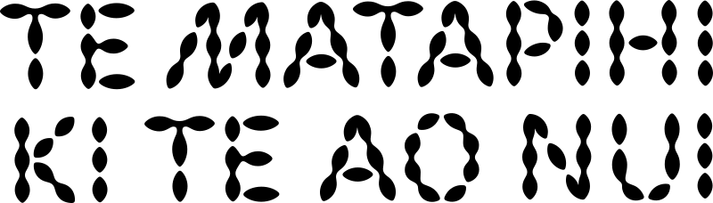
Our wordmark celebrates our name and the depth of meaning within it. Our wordmark uses our custom display typeface as a key element to add our unique visual identity to any piece of communication.
Primary wordmark
We have a primary lock up for our wordmark that will be used in most situations.The wordmark should only be coloured with a single colour application for legibility. Only at large scale can the logo use alternating colour variations as this is regarded as an expressive treatment.
Download wordmark pack
1a
Small wordmark use
When our wordmark is used at a small scale the application must be consistent with placement, clear space, and colour treatment.
Clearspace



Use the height of the ‘P’ from the wordmark for clearspace. This clearpsace will also determine your margin size in layouts.
Correct Usage


10mm

Minimum size for print applications
25px
Minimum size for digital applications



Our wordmark clearspace determines margin size for layouts. It can be placed bottom left or bottom right.
Our wordmark clearspace determines margin size for layouts. It can be placed bottom left or bottom right.
Incorrect Usage


Do not use any part of our name in isolation


Do not stretch our wordmark
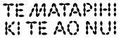
Do not use drop shadows

Do not add an outline to our wordmark


Do not place our wordmark on a diagonal angle

Do not place over busy images. Our wordmark must be legible.
Wordmark lock ups
When a piece of communication is coming from the voice of Te Matapihi ki te Ao Nui, our wordmark should be more prominent, with other logos aligned with the height of the bottom line. When the communication is in partnership, our wordmark should have equal weighting with other logos.
Te Matapihi ki te Ao Nui lead



With Wellington City Libraries

With Wellington City Archives
With Wellington City Council
Partnerships


With Wellington City Archives


With organisations outside Wellington City Council
1b
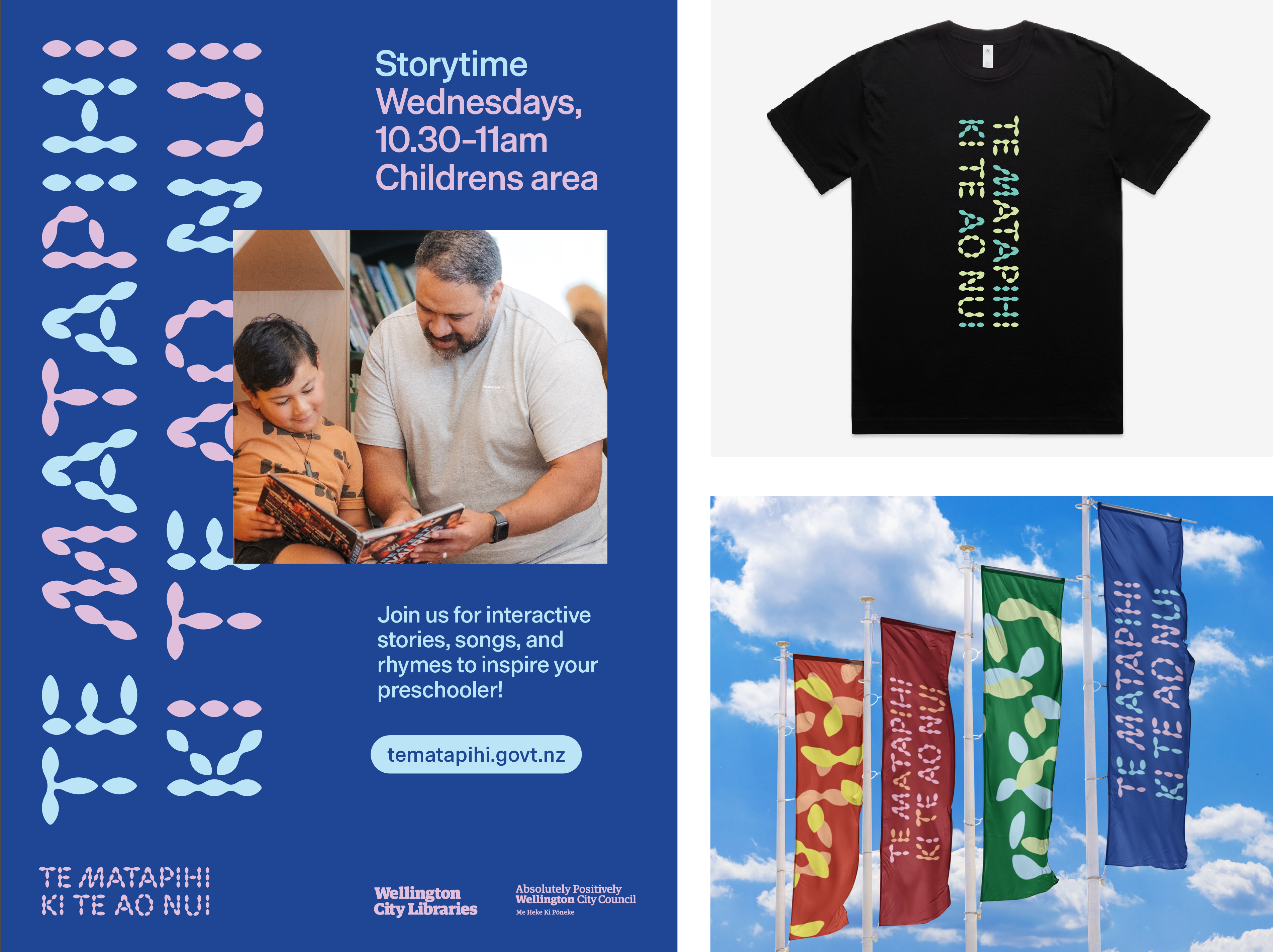
Large expressive wordmark
When appropriate, there will be times the wordmark can be used in a larger, more textural and dynamic way.
Please work with the Wellington City Council Creative and Brand team to create these layouts. Contact workflow@wcc.govt.nz
Incorrect Usage


Do not use more than two colours in the wordmark

Do not fill wordmark with a gradient

Do not set our wordmark on diagonal angles